

From old to new.
A preview of a new typeface inspired by type in Manchester


 Designer Simon Page has a rich portfolio of great posters ranging from films to celebrating the official year of chemistry. I love the simplicity of his designs yet they still connect on many levels with the audience. The chemistry posters I feel are especially clever in the way that they use symbols from chemistry and display them in a contemporary way that alters their meaning enough that it conveys a message yet still has the connection with the subject.


 I came across this article on the website Grain and Gram about printer Nick Sambrato, he runs an Orlando Florida based printing company called Mamma's Sauce. The work that they produce is really high quality and brilliantly designed. the article itself is brilliant, it gives an insight into what it means to be a traditional printer and something that I would love to do. The whole process is so fascinating and adds such a personal touch that you cannot get in modern digital printing.


The purpose of this project is to promote the awareness of global current events with the American public. ”American citizens know little about current events in general and even less about overseas events” according to The Washington Post in 2006. The article further explains that the reasons for the “unwillingness of American citizens to live up to their civic responsibilities” are due to the supply and content of our news. In the article titled “Mind the Gap,” an explanation is given as such: “Driven by market pressures, news organizations across the globe are turning to more entertainment-centered forms of reporting, making it more difficult for lazy citizens to encounter substantive political information as a matter of course. An important consequence of the shift to “soft news” has been the scaling back of international bureaus and staff.”
Heavily “domesticated” news programming creates fewer opportunities for people to learn about overseas events. Even at the height of the Cold War, when international issues were front-page news, the American public displayed only superficial awareness of overseas events and foreign policy. In the post-Cold War era, despite massive increases in education and access to information, Americans continued to lag behind citizens of other industrialized democracies on measures of international affairs information. In 1994, for example, an eight nation survey found that citizens of Mexico, Spain, Italy, Canada, Germany, Britain and France were more able than Americans to provide correct answers to a series of questions tapping foreign affairs. Whereas thirty-seven percent of the American sample was unable to answer a single question, the comparable level of ignorance (averaged) for Italy,France, Britain, Germany and Canada was 19% (Iyengar).
We often see this style of headline news design used in newspapers or weekly magazines but this undertaking of producing a new piece of design everyday for a year is taking it to a new level. I admit that not all of the designs that he has produced are of high standard but the majority are, he conveys headlines in a powerful and sometimes humorous way so that the public can become more engaged and enlightened about the issues in the news that they sometimes may not have been aware of or interested in.


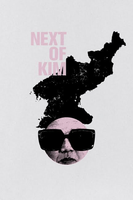


What is Static? This was essentially our brief for the first studio project of 3rd year. At first I found the project quite daunting as there was no direction or restrictions at all on the project and, as long as we could relate it to static, had complete creative freedom. I started looking at the obvious, static objects, statues, and of course, static caravans. After a discussion with Liz in which I showed her some of my experiments I mentioned that I had been thinking of communism and how it is a static state of leadership for so many years. From this my project was born, I started looking at all of the different leaders of the US and Britain since North Korea became a Communist state, I produced some typographic and image based experiments using overlaying to create some intriguing visuals.
Further looking into the subject I realised that North Korea gave off a certain ‘static’ in the way that they are so isolated from the rest of the world and don’t let anybody know what they are doing. Taking this into visuals I started looking at blocking out information and ways of coding. I created a way of coding that took the ascent line of the typeface Eastern Bloc and extended it up to create a type of barcode, each word had its own different pattern and created strong links with the idea of blocking out information. This code was good for patterned visuals but I wanted to create some propaganda posters using the idea of codes and blocked information, to do this I used a different code that you could decipher with the use of the information. This became the main copy in my propaganda posters, I used existing quotes from Kim Jong-Il and designed a series of posters and banners around them. The central poster was an image of all the US presidents since North Korea became communist overlayed on top of each other, this created a very haunting image, accompanying the image was the quote “lets take revenge a thousand times on the US imperialist wolves’. The quote was in the code as to emphasis the privacy of the state. The central poster was flanked by two red banners, one containing the quote ‘ the US is the axis of all evil’ and the other listing all of the US presidents but so that it made it hard to real and created a falling image.
Looking further into the project I found out that some people were executed for passing out anti government propaganda in North Korea. This was such a strong piece of information that I felt needed to be incorporated in my design. I decided to create a publication containing information from the latest amnesty international report. All of the information inside was in the code however the page was split into two halves and so to get the right information then you had to match up the ascent line code on each of the halves. The whole process of having to figure out the information and work to get it was to reflect the amount of effort that it took for the information to be extracted from North Korea. The cover was an image of a korean man printed black on black, once again to emphasis the point of hidden information. There was also a belly band that went around the mans mouth and was joined into the cover so the only way to open the book was to rip it open. This was to create the idea of taking off his gag and all of the information that he is not allowed to share is there for all to see. The design style of the book is the same of that of the pro government propaganda posters as to try and fit in with it and be camouflaged as pro government propaganda and therefore allow ease of distribution among a culture where it would be prohibited.
I enjoyed working on this project and felt that I really pushed myself in terms of creative thinking. I wanted to steer away from any cliche ideas and create a body of work that looked at the word static in a completely different way. I feel that the subject matter allowed me to do this and I was very pleased with the final outcomes.


